What if you could create a visual that showed your data gathering, problem solving and analytical thinking analysis all in one place? What if you could have a map which would enable you to talk to stakeholders and executives and get their input on problems, time delays, and key quality issues? That’s what the Visual Analysis Map can do for you and your team.
Many of you have developed “As Is” process maps. If you’ve built them with a team you’ve seen how the method helps employees see how their part impacts the whole process, begin to shift from blaming others to a process focus, and generates all kinds of improvement ideas.
What if we could take the map from this historical document to a whole new level of engagement, dialogue, and idea creation? That’s what I do next with the team when we create the Visual Analysis map. I use a number of visual symbols and tools to display the analysis process. These symbols are:
- Green dots with unhappy faces
- Red dots with clocks
- Orange post-its
- Hot pink data boxes
- A notched time line
- Blue post-its
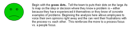 Green dots with unhappy faces
Now stand back, look at the map, and have a discussion. Where do the dots cluster? What problems do they represent? Is a problem later in the map caused by something that is missing earlier in the map? Often the team will also suggest solutions for some green dots that are very simple and can be implemented immediately. Do so!
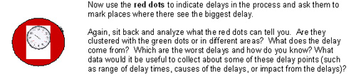 Red dots with clocks
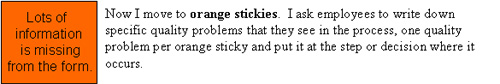 Orange post-its
Now as you step back and analyze the map, question the team to identify areas where they need to do some root cause analysis using continuous improvement tools such as check sheets, Pareto Diagrams, and Five Whys. Once this more detailed analysis is complete, the team can post their analysis sheets and conclusions on the Visual Analysis Map.
The notched time line is put on the bottom of the map. This time line configuration is a standard tool of Lean and often used on the value stream map. It shows the time each step takes and the time in between each step. A notched time line is shown in the Sales Compensation Swim Lane map below.
 A notched time line. Click thumbnail image to view full sized image.
Now you can easily see where the time wasting steps, decisions, and time between steps exist. These are obvious improvement areas. This step complements the red dot step of delays, but gives you a bigger picture of the time line for the whole process.
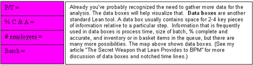 Hot pink data boxes
I use data boxes in two ways – to determine where to collect data and to record the data we discover. To determine where we need to collect data, I pass out one bright pink sticky and ask each team member to find a place on the map where they think it would be useful to collect some data. Later when the data is collected, record the actual data discovered by filling in actual numbers in the data boxes on the Visual Analysis Map.
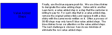
Blue post-its
The team has done significant analysis and it’s all up on the map. The map has come alive! The map is now a Visual Analysis Map. Now when the team displays the map in the work place or in a War Room, there is lots more to talk about to colleagues and stakeholders. Team members can
- Bring other colleagues over and ask them to add green employee frustration dots to the map.
- Ask employees which quality problems they think are critical.
- Get employees involved in collecting data or in doing some of the root cause analysis.
- Let employees comment on how the dots and stickies cluster in certain areas.
- Bring in Senior Management and look at the Visual Analysis Map together. Tell them about the data you collected, your analysis, and initial improvement ideas. Listen to their questions and ideas.
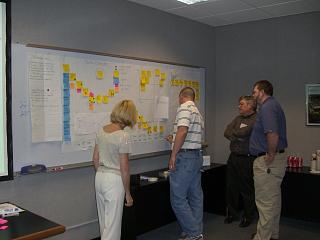
Team working on a Visual Analysis Map.
The Visual Analysis Map takes the process map to the next level. It is distinctive because it
- Allows others to see the thinking of the team
- Is interactive, enabling discussion and insights within the team and with other stakeholders
- Is one place where analytical information is summarized and visible to all
- Is the single place where information is integrated and can be viewed across the whole process
- Enhances understanding of the full process which leads to building better relationships and solutions
As I work with teams and create the Visual Analysis Maps, I also ask them to come up with other ideas to make their work more visual. Sometimes they go out and take pictures in the work environment and post them at critical steps with a short caption. I am sure you will be able to find other visual cues that you can put on your map, which are relevant to your process and its analysis. Each will improve your communication, analysis and improvements.